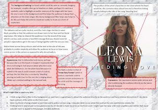
I decided to do some research on general CD album covers for the POP/RNB genre seeing as I have to make my own digipack for the second part of the coursework. I've gathered a lot of ideas so far.
If I want an effective CD cover, I'm going to need to make the image eye catching in someway. My favorite way of doing this so far is by using contrasting colours which many of the above CD album covers have used, for example, in Keri Hilson's where pinks, purples and yellow tones of colour contrast with the monochrome image of her.
The use of filters, i.e. blurry filters also prove beneficial in helping the image to stand out. Other effects such as spotlighting, and using sun rays also emphasise the artist's presence and draw attention to it. I can't wait to start testing out all of these ideas when I develop my own, but for now I could do with a LOT of practise using Adobe photoshop and even Fireworks first before I confirm any final ideas.


No comments:
Post a Comment